
ML on the Materials Project, part 5: the map of chemical space
Unsupervised learning turns 26,566 materials into a 2D map with no labels, finds groups nobody defined, and shows why data's folds rarely match your question.
Everything through part 4 was supervised: features in, a correct answer given, learn the connection between them. Part 5 removes the answers entirely. Just the 12 features, and one open question: what structure do you see?
Flattening 12 dimensions to 2
Each material is a point in 12-dimensional feature space. Humans see two, maybe three. PCA (Principal Component Analysis) finds the directions along which the data varies the most and projects everything onto the top two, the same idea as photographing a 3D object from whichever angle shows the most shape. It is linear and honest about its own limits: it reports exactly how much of the original variation the flattened picture keeps, and what each surviving axis is actually made of.
In this dataset, the 2D picture keeps 64 percent of the total variation. The first axis (PC1) is essentially heaviness, driven by mean atomic mass and atomic number. The second (PC2) is electronegativity chemistry, driven by the minimum, spread, and mean electronegativity in the compound.
One technical requirement worth stating plainly, a common beginner trap: PCA and the clustering method below both measure distances between points, so every feature must be standardised first. Skip that step and atomic mass, numerically huge compared to electronegativity, silently dominates the whole map.
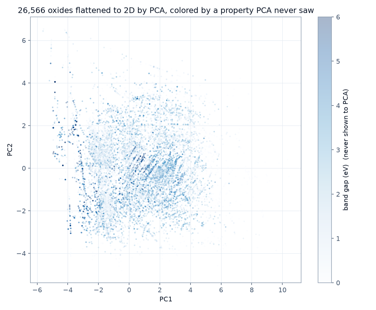
Coloured afterward by band gap, a property PCA was never told about, two things stand out. Wide-gap materials pool in specific regions: chemistry has geography. And streaky filaments run through the cloud, families locked to discrete stoichiometry ratios (AB, AB2, A2B3), each ratio drawing its own line through feature space.
Groups without labels
K-means clustering drops K pins into feature space, assigns each material to its nearest pin, moves each pin to the centre of its assigned crowd, and repeats until stable. Out come K groups that nobody defined in advance. The test of whether those groups mean anything is to check them against labels the algorithm never saw.
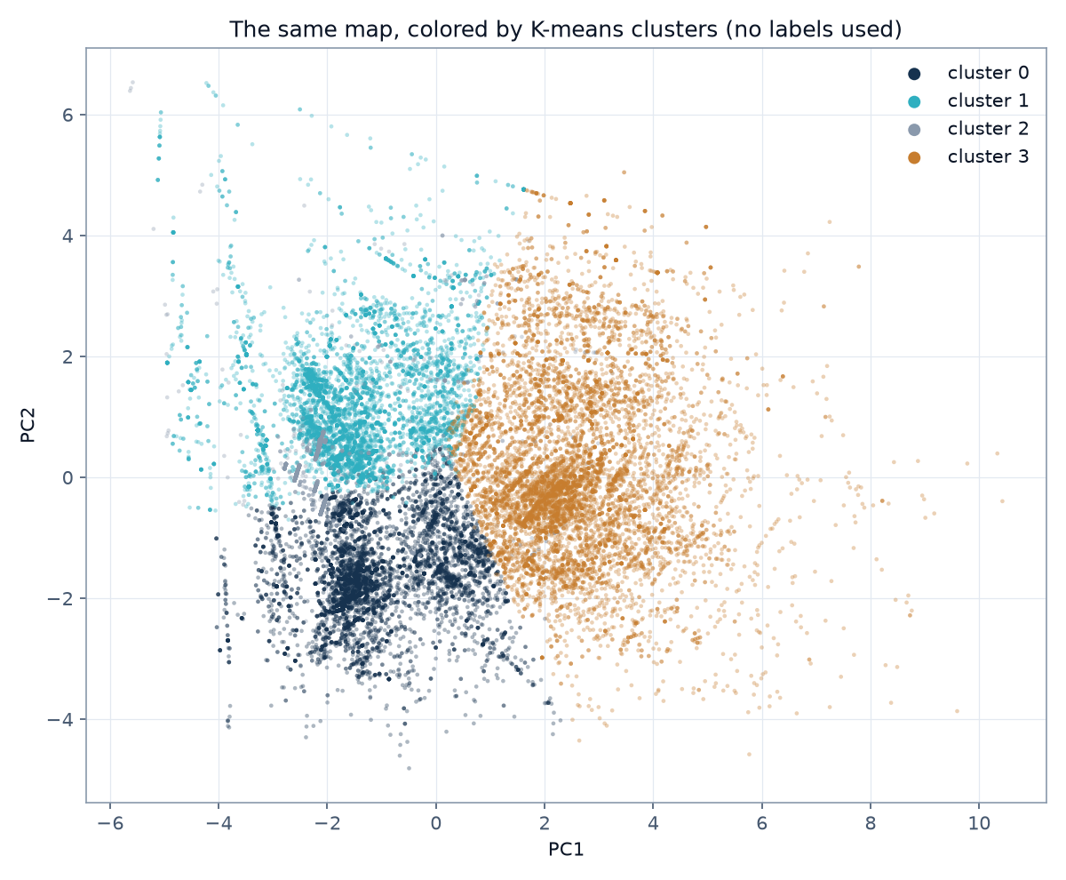
Asked for four groups, hoping to find something like metals-versus-insulators, the honest result was that every single cluster came out 32 to 38 percent metals, nearly identical proportions across all four. Instead, the clusters split along heaviness and oxygen content: one cluster of consistently heavy elements, another of oxygen-poor compositions.
The lesson is worth a poster on a wall: unsupervised learning finds the structure your features’ variance defines, not the structure you happen to care about. The algorithm was asked for groups of conductors and delivered groups of heavy things instead, because heaviness is what dominates the variance in these 12 features. Nobody promised that a dataset’s natural folds align with your question, and now there is a concrete example of them not aligning.
The nonlinear map
PCA is one global camera angle. t-SNE instead tries to keep each point’s neighbours close together, letting the overall map curl and stretch however it needs to. It is better at revealing clusters and worse at meaning: distances on a t-SNE map are not real measurements, only neighbourhoods are. (The more modern favourite for this job is UMAP; its dependencies do not currently support the Python version this series runs on, so t-SNE stands in, ships inside scikit-learn, and teaches the same underlying idea.)
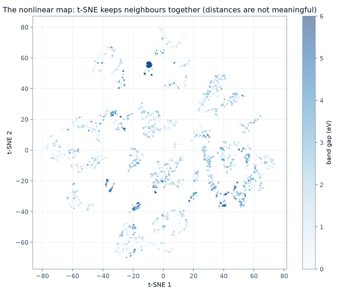
On a 6,000-material subsample, the result is an archipelago of chemical-family islands, and one striking dense dark dot: hundreds of wide-gap materials stacked on a single point. Materials only stack like that when their features are identical, which is a polymorph family. The representation ceiling that has appeared in every part since part 1 shows up again here, this time as literal geography on a map.
The takeaway
Maps do not answer questions; they generate better ones. And the groups an algorithm finds are made of whatever dominates your features’ variance, not necessarily whatever you were hoping to see. Choose features accordingly if a specific kind of grouping matters to you.
Part 6: can a model find the dataset’s errors without being told a single rule?
Found a mistake? Good, tell me. This publication flags its own suspect values. Reach me on LinkedIn.